Upward
Brand
Upward is devoted to empowering a community of lifelong learners, with a series of online courses, printed workbooks and in-person gatherings. By facilitating the development of small groups of people, members can support and encourage each other in their growth.
Product
The pioneering product of this platform is a part life-coach, part workbook. The author's research has been distilled into lessons and written exercises to identify and test viable options for a fulfilling future. The process uses the scientific method as a guide.


COLOR
Since Upward involves a process of calm introspection, the colors were derived from soothing pebble colors. They should inspire reflection and be relatively neutral so as not to distract from thought.
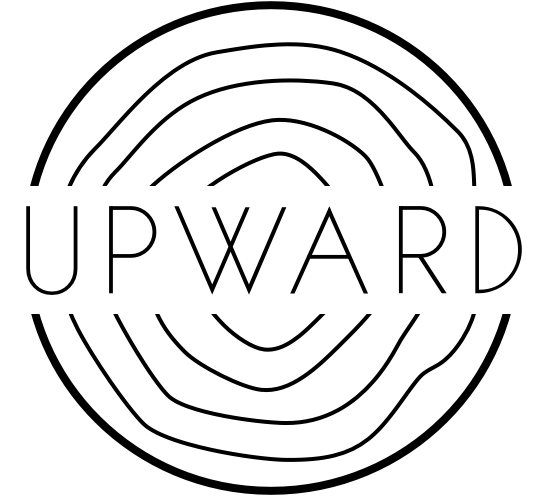
Logo
Many logo directions were explored focusing on the message of growth and way-finding. Target demographic is young adults entering the workforce or making their first job change.
"Organic growth is outward as well as upward. You are never incomplete, just expanding."


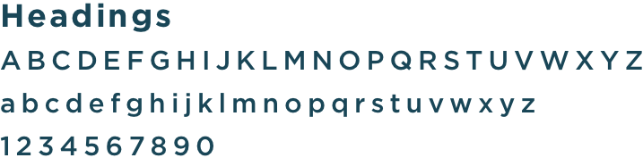
Typography
The font choice was dictated by the desire to be both friendly and reflective. The headings are a clean sans serif and the body copy is a very legible serif that has a softer feel. The simplicity of the typography compliments the user's handwriting and focuses on the answers to the prompts.